Monday, July 31, 2006

Portfolio #1 -- Man O' War

OK, so I lied. Just one more:

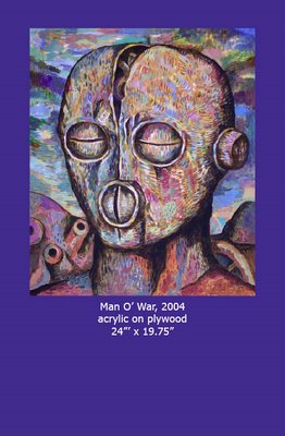
Man O' War


The final page that I'm uploading from Portfolio #1. Promise. Got to love that blue.

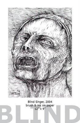
Portfolio #1 -- Blind Singer

Blind Singer

From Portfolio #1. See last 2 posts below. This is one of the monochrome images (of course) from the book. Still printed in color, as you get a little extra image depth (& you have to choose either color or b/w for the whole book anyway).

Portfolio #1 -- Drought image

Drought

Here's the drought image from Portfolio #1. Again, to show the color quality of the publication.

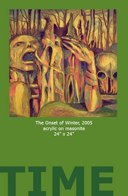
Portfolio #1 -- Onset Of Winter

Here's a page from Portfolio Number One with "The Onset Of Winter" to show the layout:

The Onset Of Winter from Portfolio #1

The online preview at Lulu changes the colors -- the green background comes out garish onscreen. This is to give a better idea of what it actually looks like...minus the bleed, of course (there's a small printed margin that's cut off in the final publication so that the background color goes all the way to the edge of the page).

Sunday, July 30, 2006

Small Drawings -- Minotaur

Minotaur, 2002
Here's another one, in this mini-preview of the portfolio, Small Drawings. This one is also from 2002, pen & ink, 8" x 5" approx.

Whenever I think of the Minotaur, I think of Picasso, so I make my Minotaurs more vulnerable & melancholy. Picasso's were more of a symbol of virility, destruction & brutality, I think.

The finished portfolio should have a page count of 36. Most of the images haven't been seen in print or on the web before. By my count, around 11 have been available one way or another previously, so 25 are "brand new". The dates when the pieces were created range from 1991 to 2005, with clusters around 1992 & 2001-2005, as those are the periods when I was slightly more likely to sit down with a small piece of paper & a pen or brush.

Asleep In The Abyss

Asleep In The Abyss

The stats: circa 2002, brush & ink on paper, 6" x 5.5".

This is the probable cover image for my second portfolio, forthcoming via Lulu.com, "Small Drawings". Over the years I've accumulated a number of small artworks in ink on paper, that were either finished pieces in themselves, studies or sketches for other works (though I've never really consciously done sketches per se, except on rare occasions), or curios, or whatever. They tend to be looser & more spontaneous than my more finished pieces (which in themselves are more spontaneous than they probably appear at first glance), & have a charm (if that's the right word) all of their own. They range from the beautiful to the puzzling to the terrifying to the grotesque to the bizarre -- sometimes all at once.

I'm currently thrashing around with the layout & cover, though hopefully I'm more or less there. There's also the question of whether I should print it in b/w (& shave a dollar or two off the price) or print it all (the pieces are all monochrome) in color & have the slightly better quality. I'm leaning toward the latter...

Wednesday, July 26, 2006

Portfolio #1 Released

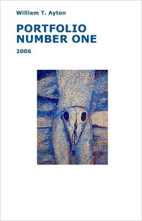
The proofs came back from Lulu.com today & it looks good -- in some ways, better than I expected. The paper is good quality & semi-glossy. The colors are rich & saturated. You can see the cover below:

Portfolio #1 cover -- click to go to Lulu.com

Images inside include some old favorites; Narcissus, Babel, Drought, Empire of Death, Helm Head, Onset of Winter, as well as a few seldom-seen pieces.

You can buy or preview the entire 24 interior (full-color printing, includes some monochrome images) at this link, but I should mention that the online preview images are far inferior to the printed ones. Cost is $11(US) plus S&H.

Sure to be a collector's item!

Monday, July 24, 2006

Dia Beacon

Well, we finally made it down to Dia (contemporary art museum focusing on minimalism, etc.) in Beacon, NY. We drove down Route 9, which is known for its frequent traffic lights, so we broke up the trip at IHOP. When we got to Beacon, we proceeded to get lost for a while, as, while there is signage, it's not very prominent. But we got there -- you have to go down Main Street towards the river & station, by the way. It's very close to the station.

The place itself is very impressive, an old & very big factory building complex. The parking lot seems quite small -- maybe there's another parking lot somewhere. It was $10 for the adults, but the kids (under 12) got in free. There was lots of space for the kids to walk (not run!) around in. They especially liked the comfy sofas in the Warhol "shadow" (an unusual series of paintings for him -- they're all basically abstract) room. They also liked the fish fountain in the basement (Bruce Nauman, if I remember correctly), and other stuff. My personal favorite was Louise Bourgeois' large "Spider" in the upstairs part. The Richard Serra large cylindrical-ish rusty steel sculptures that we could walk inside were also a big hit.

You can get all the info here. You should pay a visit -- well worth it. The bookshop/cafe is not bad, either.
Friday, July 21, 2006

Portfolio Number One

I'm currently working on a small portfolio/sampler that will be available for sale via my own web site & Lulu.com, the online publisher. This is an experiment in publishing, & I'm not sure how it will turn out. I've just ordered a couple of copies to see how they print. Hopefully, all will be well, & with a bit of minor tweaking it will be all ready to go.

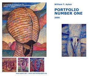
The portfolio will most probably be in "comic book" format (that's a Lulu thing), with 24 interior, full-color (except for a couple of drawings & monochrome pieces) pages. Here's a sneak peek of the cover (front & back) as it currently stands:

Portfolio cover

Depending on how this goes, I may produce other thematic portfolios, as I have various series of artworks. There's also the option of doing a more comprehensive art book. At the very least, it's a useful (if a little expensive) promotional item for galleries and art directors...

Friday, July 14, 2006

Minor Update

Nothing much happening right now. The main thing I have to do today is trim the wisteria on the pergola that is threatening to entangle the entire house, which might be interesting to look at, but expensive in the long run. It's funny -- until recently, "wisteria" & "pergola" were words that I never would have used, but we bought this place with them, so there they are.

Friday, July 07, 2006

Narcissus -- new photo

Narcissus

I just put a new, higher-res version of this painting on my web site here. It was taken under different lighting conditions (exterior daylight, if I recall correctly), & the colors are brighter & more vivid. Here it is, scaled down to the same size as the one above, below.

Narcissus

Monday, July 03, 2006

Biblical Archaelogy

I recently found a site with great images -- photos of actual sites, not dubious piles of rock (see entries below), which I find more fascinating to look at & read about than probably spurious claims of Noah's Ark in Iran, or the pyramid in Bosnia.

Here it is. And the blog (also fascinating, by a guy on the spot).

And here's a basalt formation, which looks at least as man-made (to me) as the Ark images (scroll down past all the other stuff).