Sunday, May 31, 2009

Pages from Ayton Volume I, 2006

In honor of my old portfolios being released on Amazon marketplace recently, and their cover thumbnail images appearing (which for some reason takes a while on Amazon, longer than the book titles & descriptions), here are a few selected pages from the Ayton Volume I portfolio. Click on the images for a better view:


Front cover, with Narcissus painting from 1991.


Title/dedication page, with Narcissus drawing from 1991. Dedicated to Diana, my wife, muse, goddess, poet, mother of children, etc.


Page 6, Minotaur from 2006.


Page 14, with Medusa drawing from 1992.


Page 30, with Arbeit Macht Frei (Holocaust) sketch from 2005.


Page 40, with Morning Over Sparta from 2006.


Page 45, with Day of Creation from 2006.


Page 52, with Arch of Debris from 1998.


Page 64 (last page) with Drought from 2005.

Looking back over this portfolio, a few things struck me:

1. It's almost 50-50 color work & monochrome, with color just winning out. That's fine, as that's a fairly representative breakdown of my output -- I tend to do a lot of drawings & large, mononchrome painted pieces.

2. As I released this portfolio in 2006, it's weighted quite a bit toward recent work of that period, as that's what was present in my mind and studio at the time.

3. I tried to represent a couple of major series of works, including the War Room & related work (done a couple of years before) and the Holocaust series (done around 2005). I didn't include the UDHR (human rights) paintings, as they didn't go very well stylistically with the other works.

4. At the time, I cut the selection down to about 64 pieces (the number of pages in the book), for a couple of reasons: the cost of doing a book like this was pretty high, & also to keep the quality of images up to a certain standard. I omitted a lot of very good work. Also, it's been about 3 years since I published this, so I have accumulated a lot more work...a Volume II would not be out of the question.

Handy links:

See my books on Amazon
See my books on Lulu

Friday, May 29, 2009

The War Room Portfolio

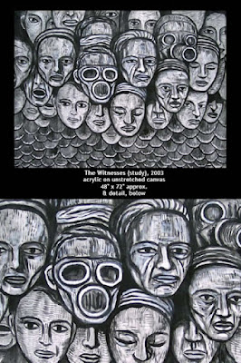
Also from around 2006, here are a few sample pages from the War Room portfolio (see posts below for more on portfolios), which now also comes up on Amazon. The War Room is a 4-wall painted installation that surrounds the viewer with the 4 faces of war: warriors, witnesses, victims & aftermath. Please click the images below for a slightly bigger view:


Front cover, with a detail from the Warriors panel. The painting is actually monochrome, but I screened it blue for the cover.


The Witnesses, whole & detail.


Aftermath panel, NYC. Visible through the gap in the middle is The Peace Piece (mannequins & video), by Adelle Lutz, which was shown in the same space.


Cored, a related anti-war drawing.


Man O' War, related painting.

As I mentioned, you can find this small portfolio on Amazon now. I printed it in color, even though many of the images are monochrome. You can also download a free PDF version from the War Room web site.

Handy links:

See my books on Amazon
See my books on Lulu
Small Drawings Portfolio

Regarding the post below this one -- my old portfolios have suddenly appeared on Amazon, actually Amazon Marketplace, which is a bit different I suppose, but they show up on regular Amazon, so to all intents & purposes it's the same. The reason they've just shown up on Amazon, I think, is that Lulu.com (owned by Amazon, the last I heard) has put many of their publications there. Lulu is the on-demand printer I used to publish my portfolios.

I've just been leafing through the Small Drawings portfolio. I hadn't looked at these for a while, as I released this and the other 2 (Ayton Volume I & the War Room portfolio) around 2006 without much fanfare. There are some interesting pieces in them, that I had more or less forgotten about. Here is the cover of the Small Drawings book with a few samples of obscure pieces. Enjoy.


The front cover. The drawing on the cover is Minotaur Squared, 2002, brush & ink on paper, 9" x 6.8". This drawing is also on page 54.


Ball of Souls, 2002, 9" x 7", ink on paper. On page 5.


Coiled, 2002, 11.5" x 8.25", brush & ink on paper. Page 17.


Figure in an Egg, 1992, ink on paper, 5.8" x 4.2". Page 25.


Figure with Missing Arm, 1998, ink on paper, 4.5" x 3.25". Page 55.


The Swan-necked Swan, 1992, ink on paper, 8.5" x 6.75". Page 72.

Most of the pictures in the portfolio have not been published before, either in books or magazines or web sites, etc. A few have. Looking back, it's an interesting selection of oddities, as well as more mainstream pieces, some of which were developed into paintings or other drawings, or, in some cases, should have been or might still be yet. Also interestingly, they tend to be clustered around certain years when I was more likely than not to pick up a brush or pen & small scrap of paper & put something down. At other times, I was more focused on large drawings or paintings.

The book has 78 pages in it, & there are 77 drawings & not much text.

I should at some point put together a volume 2 of this. No rush.

Handy links:

See my books on Amazon
See my books on Lulu

Tuesday, May 26, 2009

My older books now available via Amazon

I just received an email from Lulu.com, the on-demand printer where I published a few portfolios a couple of years ago (around 2006) -- Ayton Volume I, Small Drawings & The War Room Portfolio. It seems they are now available on Amazon Marketplace (I have been selected for this honor). I guess this is very nice, more people will now be able to find my books, and, hopefully, buy them. Below is the front cover of the Ayton Vol. I portfolio (with the Narcissus painting from 1991):


Just go to Amazon & search under my name, you should find them. So far, only the one above has an actual cover image visible on the Amazon page, but the others will probably follow in due course.

BTW, the books are cheaper if you go to Lulu.com & get them there (my profit margin stays the same), though if you are buying a number of items on Amazon, it might work out better for you with regards to shipping & so on.

Handy links:

See my books on Amazon
See my books on Lulu

Thanks for looking.

Woman With a Very Long Neck (Beauty Among the Ruins)

After my brief interlude of high strangeness sigilry (see post below this one), here is a new (actually, newly enhanced) drawing for the Entropy Series:


Woman With a Very Long Neck (Beauty Among the Ruins), 2009, brush & ink on paper, 23.5" x 18".

It's from my Mannerist period, which lasted, oh, for the length of time it took to do this drawing. I did it a week or so & was almost happy with it, I even had it uploaded on my blog for a little while, but decided I didn't like the neck, mostly. I think I've now improved it, as well as a few other parts of the drawing. Time will tell, as usual. I may take it down again.

The Sigil Experiment (A Flock of Sigils)

Here are some sigils (thanks to seeing a Grant Morrison video linked from the Daily Grail, reminding me of Austin Osman Spare):


OK. That's a lot of sigils...

Wait. What's that you say? What is a sigil? Basically, it's a means of visualizing a wish or desire & making it become real, via magick as practiced by Spare, Crowley & many others. I'm not so much into the magick part (unless it actually works that way). Here are the steps as outlined by Morrison (more or less):

1. Write down a wish
2. Remove the vowels & any duplicate letters
3. Make it look "magical"
4. Concentrate on the image & the wish will hopefully become realized

Because I usually make stuff up anyway, I've altered it a bit:

1. Write down a wish
2. Remove the vowels & any duplicate letters
3. Arrange the remaining letters in a more or less visually appealing way
4. Surround them with an "energy field" (the horizontal lines)
5. Upload them into the Matrix (OK, Internet in this case)
6. Hope it all works

I don't know if any of these wishes & desires will come true, but if they do, I'll most likely mention it here. Also, I made sure that all of them were positive wishes. Also, I added a couple of non-selfish things in there. All of the wishes are pretty much within the realms of possibility. I misspelled one, we'll see if that one works better or worse. I didn't go to elaborate lengths to disguise the messages, so you can probably figure some of them out. If any of this backfires & I'm abducted by interdimensional beings (or "aliens"), I'll mention that here, too.

Actually, Morrison claims he was abducted by aliens from Sirius in Katmandu in 1994 in an out-of-body experience of some kind, where they explained the universe to him. It sounds reasonable to me. I was in Katmandu around 2000, but was not abducted...

Morrison mentions in the video (link above the sigils) that he believes that language/images can be used in this way to hack into the "operating system" that surrounds us. I think language/images are the operating system...in computers, as I understand it, the OS (Windows, OS X, whatever) actually sits on top of a lower-level operating system called the BIOS (Basic Input-Output System), so in my visualization, the sigils are just regular OS commands...but I may be wrong on this.

If nothing else, my blog might get a few more hits from people searching for sigil info.

OK, that's enough about sigils.

Hiroshima: Ground Zero 2009

Reflecting on the Museum on the Seam (& NY Times) references below, it occurred to me that the Hiroshima: Ground Zero image would fit seamlessly (pun intended) into the Entropy Drawings, so I created a new version:


Hiroshima: Ground Zero, 2009, brush & ink on paper, 23.5" x 18".

This is not a copy per se. It's much larger than the previous versions, which were small. I created it without referring to the original(s). It's done in brush & ink, the original drawing was done in pen & ink (a somewhat rusty Speedball ink pen that I found lying around at the time). There are slight differences in the layout & details. However, the essence is pretty much the same, with the vaporized souls of Hiroshima depicted in the spaces between the hatching.

In general, I don't like to repeat myself literally -- of course, themes and images recur throughout my work. However, from time to time I like to return to an iconic piece, to see if something new can be drawn out of it.

Museum on the Seam in the New York Times

It's good to see that Raphie Etgar's Museum on the Seam in Jerusalem (I was in the Bare Life show there, & have a piece in the permanent collection) has been featured in the New York Times. It was in an article in the Travel section, entitled "Where Art Thou: Twenty-Nine Places that will Open Your Eyes and Blow Your Mind". The museum was number 5 on the list, in the online part anyway.


The Museum on the Seam a couple of years ago. The museum is dedicated to political art.

Here's the link:

www.nytimes.com/indexes/2009/05/17/style/t/index.html#pageName=17artw

Kudos to Raphie.

You'll need Flash & javascript installed. MOTS is number 5 in the small thumbnail icons at the bottom of the screen. The other places look pretty cool, too.

Postscript: BTW, the painting of mine in the Museum on the Seam's collection is this one:


Hiroshima Ground Zero, 2004, acrylic on board, 12" x 9".

It was based on this drawing:


Hiroshima Ground Zero, 2001, pen & ink on paper, 7.3" x 6.4". It was published in the NY Times on the Op-Ed page, as you can see from the header, on August 6, 2001, on the anniversary of the Hiroshima bombing. So, from the NY Times to the Museum on the Seam to the NY Times again. So, that loop in the time-space continuum has been completed for me, and we move on...

Monday, May 25, 2009

Hope Among the Ruins

Here is a drawing I did a few days ago, uploaded here, then took down again as I wasn't sure it was worthy of inclusion. Maybe all it needed was a title change:


Hope Among the Ruins, 2009, brush & ink on paper, 23.5" x 18". There is always hope, speaking of positivity, as we were.

Artworks with a strong, positive message

I got a comment a couple of postings below complimenting my work, but asking if any of my work has a positive message, as much of it seems to be dark. Well, I am in the midst of a series of drawings called the Entropy Series, which depicts the world literally falling apart into disorder, but I believe I have created a number of works which have a positive message for humanity:


The Golden Age, 2004. This is not necessarily a nostalgic piece looking back to a long-lost utopian state for humankind. I believe we are on the cusp of a new golden age, we just have to realize it.


To Life, 2005. Private collection. Just before I had done this painting, I had created another image entitled "Empire of Death", which I thought was fairly self-explanatory. This was the antidote I created to that image. It does look a little melancholy, but is suffused with light, and life.


The Lovers, 2006. The power of love to illuminate the darkness.


Universal Declaration of Human Rights, Article 6, 1991. The UDHR series focuses on the rights & freedoms that should be enjoyed by all people, everywhere. Most of the images have a strong, positive message. Of course, some, such as the image depicting torture, do not have such an upbeat message, but I felt it would be irresponsible of me not to depict that. And so on. From a series of 30 images, viewable at www.udhrart.org.

So, I think that makes it reasonably clear that, while much of my work deals with a negative message (yet still seeks to find light in the darkness, I hope) there are at least some images which are very positive. When I'm done with my current preoccupations, I'd like to make some more conventionally "beautiful" images...

Friday, May 22, 2009

RICS - Rhinebeck Institute for Creative Studies


This is to mention that I'm working with a couple of artist friends, James E. Ransome & James L. Stevenson (I only work with people called James) on the Rhinebeck Institute for Creative Studies (RICS). This is a loose grouping of the 3 of us, who are offering classes & workshops in our own studios to interested parties. We are all professional artists with considerable experience, so I think we have something potentially very useful to offer to other artists & students who may be just starting out or needing help in some way.

For more information, please check out the RICS blog.

Other links:
www.ayton.net (my main web site)
www.jamesransome.com (James Ransome's site)
www.jlsfineart.com (Jim Stevenson's site)

Thursday, May 21, 2009

Head of a Boy (pencil)

I don't usually work in pencil:


Head of a Boy, 2009, 23.5" x 18", pencil on paper.

Maybe I should, this came out reasonably well, and it's much quicker than brush & ink. However, the contrast is not as strong, so the photo shows up the shadows on the page when I increase its contrast in Photoshop...

Wednesday, May 20, 2009

Masked Colossus Destroying a City

A new drawing that came out better than I thought it might:


Masked Colossus Destroying a City, 2009, brush & ink on paper, 23.5" x 18".

It has an endearing clumsiness that I like. Also takes me back to those early 60s (or late 50s, even) Jack Kirby / Stan Lee comics where a giant monster would be destroying a city while the terrified populace (or a half dozen of them) would scream out of the lower part of the image. I didn't put in the terrified populace. Also influenced by those Breughel paintings etc. where the landscape stretches off to infinity with a seascape & boats etc. I didn't put the boats in either.

Monday, May 18, 2009

Biohazard

A new ink drawing of an armored figure:


Biohazard, 2009, brush & ink on paper, 23.5" x 18". I like the idea of depicting armored figures, in this case the result reminded me of a biohazard suit of some kind, or some kind of futuristic protective garb. This drawing became an exercise in rendering, as much as anything, and an excuse to stretch my lines out over some relatively simple shapes.

Sunday, May 17, 2009

Ruined Man

An Arcimboldoesque (see link) Entropy drawing of a figure made up of ruined architectural elements:


Ruined Man, 2009, brush & ink on paper, 23.5" x 18".

I've kept the background empty. I might do another version with a sky or landscape or something...didn't seem necessary. I could even do a mini-series of figures like this. BTW, I don't always do sketches for these, but in this case I did. Here is the original thumbnail sketch:


That's done on the back of an envelope, as you can probably see. It was lying on my desk when I had the idea. The confirmation number refers to my electricity bill & has no deep significance.

Upheaval

New Entropy drawing:


Upheaval, 2009, brush & ink on paper, 23.5" x 18". If you look closely, you can see a couple of pencil sketch lines -- those will be erased.

Saturday, May 16, 2009

It's All Over

Another ruined colossal head drawing:


It's All Over, 2009, brush & ink on paper, 23.5" x 18".

Friday, May 15, 2009

The Citadel Falls

New Entropy drawing:


The Citadel Falls, 2009, brush & ink on paper, 23.5" x 18". I was looking at Breughel's Tower of Babel the other day, might be related to that.

Tuesday, May 12, 2009

The Death of Death

A new drawing, a little dark perhaps (but maybe not if you think about it):


The Death of Death, 2009, brush & ink on paper, 23.5" x 18". Entropy Drawing.

Monday, May 11, 2009

The Final Wall

Another Entropy drawing:


The Final Wall, 2009, brush & ink drawing, 23.5" x 18". What's your final wall? And what's behind it?